New galleries and templates to make your life easier!
Choose from more design options when creating your user-generated campaigns with Qualifio
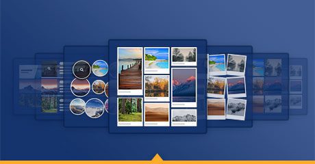
In today’s post, we bring you 5 new gallery types. Now you can customise even further how your photo, video and text galleries look thanks to a total of 8 different available layouts.
1. The mosaic gallery
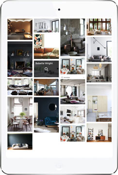
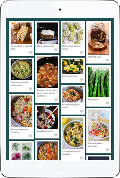
This gallery is basic and beautiful at the same time. Use it as a visual inspiration for your audience: home decor, food recipes, DIY projects, etc. You can discover this new gallery style here.
2. The mosaic polaroids gallery
A good alternative to the simple mosaic gallery. If you want to showcase your products in a dynamic layout, it is made for you. Here is an example.
3. The bubble gallery
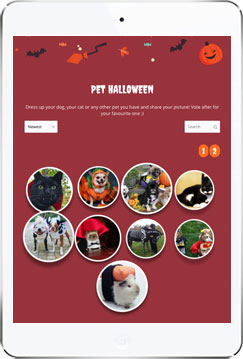
If you’re looking to display your images in a unique way, the bubble gallery can help. Hover over images, and you will find that we’ve built some cool effects into this one. Choose this gallery type if you need something lighter and sweet 😉 View our demo gallery.
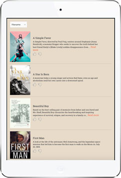
4. The list gallery
This gallery style allows you to display additional information directly in the gallery to increase clicks, conversions, or votes. It will perfectly suit topics such as entertainment, culture, or politics. Ask your audience to give their opinion about movies, books, songs, or to vote for artists or politicians, etc. Here is an example.
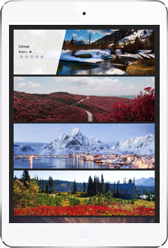
5. The horizontal gallery
This is the perfect gallery type to highlight art, travel and landscape pictures. Try this new gallery type here.
Of course with all galleries, you can still
- display photos or videos;
- create galleries with votes or simple albums (without vote);
- enable visitors to see more details in enlarged previews;
- sort images randomly or based on the date, name, or number of votes;
- add social sharing and virality options;
- publish on your website, Facebook page, mobile app, or on a dedicated minisite.
5 new templates for trendy campaigns
But there is more: you may have noticed that new layout options are available in the templates library. Now, when you go to customise the look and feel of a campaign in Qualifio, you’ll get 20 templates to choose from. Whatever the occasion or the topic of your campaign, we’ve got you covered! Pick your favourite design and customise anything you want.
Here’s how:
1. Go to your campaign’s ‘Look and feel’ step
2. Pick the template you want
3. Click ‘Change look and feel’ and start editing
Plus some other new stuff
- Look and feel: create even richer campaigns. Insert links behind the banner and/or footer of your campaign, and add your own HTML or JavaScript code directly in the Look and Feel step for advanced customisation. Also: align all your campaign elements to the centre at once.
- Identification forms: view all your opt-ins in an easy-to-read table. Get a better experience adding the opt-ins you need to your form thanks to our new opt-in selector, which is now available for all identification forms.
- Jackpot campaigns: choose whether or not to show an anti-cheat QR code. Here’s where to go: Your campaign > Jackpot > bottom of the screen. Note: This option is activated for all jackpot campaigns by default.
- Fixed menus: easier navigation in the campaign edition. You may have noticed that the campaign edition experience feels a little different. That’s because we added a “sticky” navigation bar at the bottom of your screen. It makes it easier to access the saving options, regardless of where you may be on the page. Find it unnecessary or distracting? No worries, you can make it disappear by editing the settings of your account. Bonus: you can also choose to add fixed breadcrumbs (with campaign steps) that will guide you through the campaign creation process.
