5 new Global Stats features: full PDF or PNG exports, enhanced look and feel, hourly update and more

In our digital world, data is one of the most valuable resources today’s businesses have, and you could say that the world has become quite excited for analytics and visualisation. But while being data-driven is necessary to make better decisions and grow, how much data is too much data? In other words, with all the information you must gather, measure and monitor, how do you know if you are getting the most out of your data? A crucial first step to harnessing that data is finding an advanced, professional dashboard with curated information.
Over 400 companies around Europe use Qualifio’s data collection platform, and we’re continually striving to introduce features that will help them improve their strategies and give a boost to their marketing efforts. So, today we are excited to announce the new all-in-one dashboard that will enable our users to take their data analysis and visualisation to the next level.
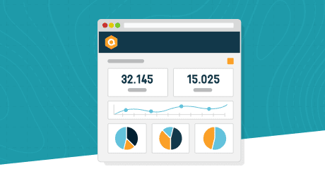
The Global Stats got a serious makeover and new features to mark their 5th birthday ?
The new global dashboard currently includes 22 visualisation widgets and is a great way to quickly get hold of the most important metrics from all your campaigns.
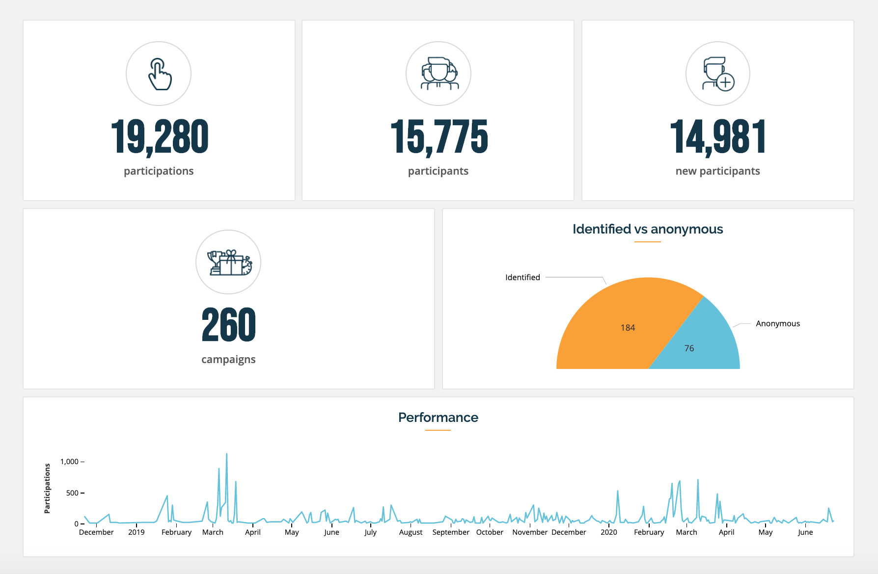
The dashboard starts with an overview. This first section helps you keep an eye on your key metrics such as the number of participations, participants and new participants. You can see engagement for campaigns across websites and formats and how participations are changing over time. Are quizzes your best way to boost audience engagement? Maybe polls? Instant wins? Or puzzles? Do you remember when your concurrent participants peak was? Don’t worry, we don’t forget anything.
The power of an interactive dashboard
Clickable pie charts enable you to quickly jump to a segmented view. This interactive feature allows you to click on individual chart segments (or ‘wedges’). Therefore, if you are interested in a particular segment of a chart, be it a specific website or format, you can click on it to see the related stats. This can help you spot interesting correlations and trends.
On the other hand, you can also see a list of top 20 campaigns with the most participations, participants or new participants. This can help answer questions such as: What were the top-performing campaigns? Which formats generate the most leads?
Lastly, UTM parameters and user agents answer questions like “what are the top traffic-driving channels?” so that you can optimise your promotional campaigns.

You can read more about the feature in the documentation.
What’s new
The new version of the “Global Stats” has a fresh and modern look and feel, user-friendly filters, hourly updated data, and improved performance. Let’s talk about the upgrades we made and the features we added to the dashboard.
1. New filters
Filters are a rather simple but powerful feature, which enables you to quickly obtain valuable information out of even the largest sets of data. Which is why we’ve added a bunch of new ones in the Global Stats:
- All participants vs new participants only: There are two types of people who interact with your campaigns: those who have never done it before, and those who have. This is a useful filter when you want to understand who is coming to your campaigns.
- Identified vs anonymous: This filter displays the numbers and percentages of known participants with an associated email address in the CRM versus the number of participants without an email address in the CRM.
- Filter on specific campaigns: To merge the statistics from two or more campaigns, you can use this filter.
2. All in one place
Quit opening a new page or app to see your data analytics. With the new Global Stats, it’ll all be right there within Qualifio for you whenever you want it!
3. Dashboard export
Sharing is caring… and productive. Users have been asking for a way to share full dashboards. Now you can export your entire Global Stats dashboard “as is” using our “dashboard export” feature. Download, print and share beautifully formatted PDFs or PNGs from your dashboard.
The export button on charts hasn’t gone anywhere, so you can get your data while deciding for yourself what information to export from the dashboard.
4. Enhanced look and feel
You can now see your data in a state-of-the-art, modern dashboard. Switch back and forth with Qualifio’s original Global Stats, released back in 2015:
5. Hourly update
With the new Global Stats, graphs are automatically updated every hour with the most current data available.
The idea behind all these dashboard improvements is to show you more useful data and stats. Want a little more information about the Global Stats dashboard? Click here to find out more.
Take a look for yourself!
Who doesn’t need more visibility into their work? New Global Stats are now available for all Qualifio users. Try them out and tell us what you think of it! Or request a demo from our team to learn more about this feature.